


Composition Strategies For Each Approach
Seek side light, bold silhouettes, and repeating patterns. Train your eye to notice micro-contrast and the way textures stack. Ask if removing color strengthens form, then invite feedback on whether your frame feels more focused.
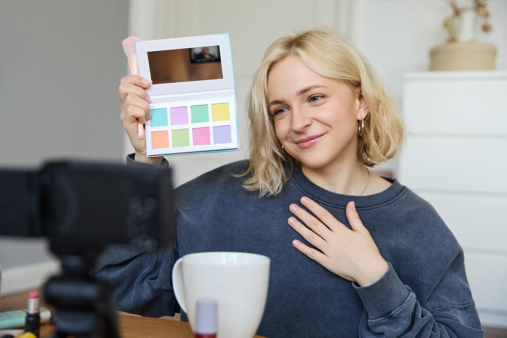
Composition Strategies For Each Approach
Use complementary colors for energy, analogous palettes for calm, and accent colors to guide attention. Limit your palette intentionally to avoid chaos. Post an image using just two dominant hues and describe your choices.