Chosen theme: Techniques for Balancing Warm and Cool Colors. Explore how temperature contrasts can energize your visuals without chaos. Learn practical methods, inspiring stories, and simple ratios you can apply today. Share your experiments, subscribe for weekly palettes, and tell us which warm–cool combinations excite you most.
Understanding Color Temperature: The Science Behind Warm and Cool
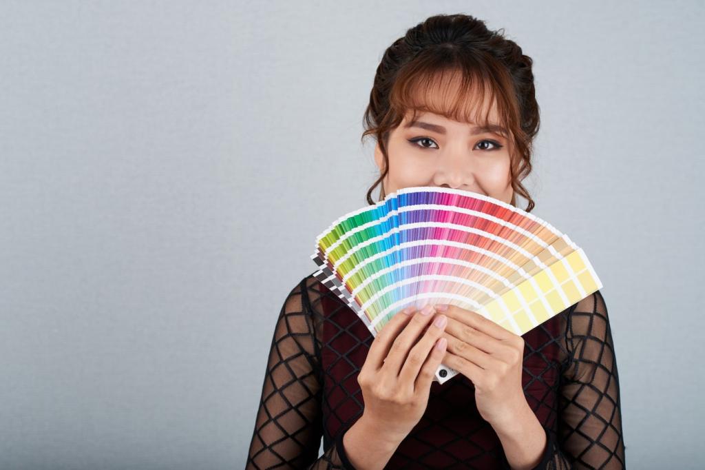
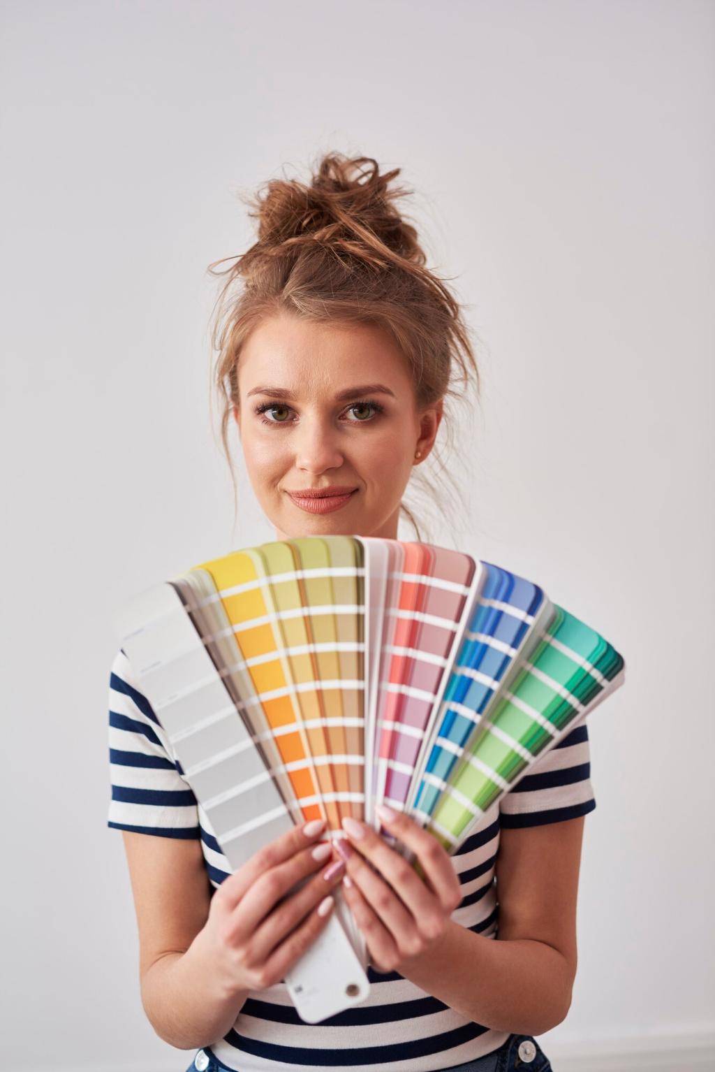
Warm vs. Cool Basics
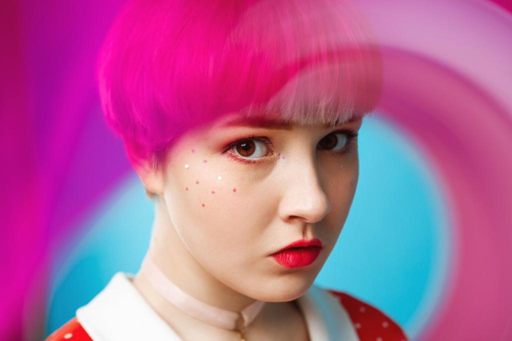
Warm colors lean toward reds, oranges, and yellows; cool colors gravitate to blues, greens, and violets. Using Johannes Itten’s wheel helps visualize tension and harmony between temperature families.
Light Temperature in Kelvin
Bulbs around 2700K appear warm and cozy; daylight near 5000–6500K feels crisp and cool. Calibrating your working light ensures your warm–cool balance looks intentional rather than accidentally shifted.
Simultaneous Contrast in Action
Place a warm note beside a cool note and each grows more intense, a phenomenon described by Chevreul. Harness this effect to add vibrancy without oversaturating every color in your composition.
70–20–10 Temperature Ratio
Start with a dominant temperature at 70%, a contrasting temperature at 20%, and a 10% accent for sparks. This structure prevents visual shouting while keeping the palette lively and focused.
Begin with a cool underpainting for shadow structure, then layer warm lights to summon vitality. This contrast creates depth, guiding viewers’ eyes toward focal points without relying solely on heavy outlines.
Mixing to Neutralize
Mix a touch of the complementary temperature into your color to mute it. For instance, a breath of ultramarine cools a fiery cadmium orange, creating sophisticated neutrals that still whisper warmth.
Edge Temperature Shifts
Sharpen warm edges where attention should land, soften cool edges in receding areas. Temperature variation along contours builds believable space, even in stylized pieces where perspective is intentionally simplified.
Intentional White Balance
Instead of always using auto white balance, set Kelvin manually to preserve mood. Warm tungsten interiors benefit from gentle cooling, while blue-hour exteriors often sing when warmed slightly to human memory.
Split-Toning for Depth
Assign cooler tones to shadows and warmer tones to highlights to create cinematic dimensionality. Subtlety matters: small pushes in hue and saturation read richer than heavy-handed filters or global temperature swings.
Gels and Practical Lights
Use CTO or CTB gels to balance fixtures on set. Let practical lamps add localized warmth while daylight fills remain cool, producing organic, believable environments without fighting mismatched light sources.
Digital and Brand Design: Consistency with Character
Pair warm and cool hues that also meet readability targets. Test WCAG contrast on both light and dark modes to ensure emotional temperature never sacrifices clarity or inclusive user experiences.
Digital and Brand Design: Consistency with Character
Use warm highlights for success or human touch, cool feedback for system neutrality. Subtle temperature nudges in hovers, toasts, and loaders create emotional continuity without overwhelming the interface.
A Quick Story: The Poster That Finally Breathed
A music poster drowned in hot reds and screaming yellows. Nothing rested. We cooled the background into twilight blue, then warmed only the singer’s face and hands, letting emotion concentrate.